
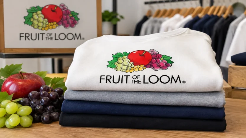
The Fruit of the Loom logo is one of those everyday designs most people recognize instantly. An apple, grapes, leaves, and a few smaller berries sit clustered together, usually above the brand name. It appears on underwear tags, T-shirts, and packaging, and it has done so for generations. The image feels familiar, almost inevitable, given the company’s name. Yet the story behind it is more specific and practical than many realize.
This article looks at what the logo actually shows. It explains how the design connects to the brand’s name and early history. It also covers how the logo has shifted over time and why so many people insist they remember a cornucopia that never appeared in the official mark.
What Is the Fruit of the Loom Logo?
The current Fruit of the Loom logo features a simple, stylized cluster of fruit. A red apple sits in the center. Bunches of green and purple grapes surround it, along with green leaves and small yellow or white berries. People often identify those berries as gooseberries or currants. The fruit sits above the words “Fruit of the Loom” in a clean, modern typeface. There is no frame, no oval, and no background container.
The design is flat and illustrative rather than realistic. Thick outlines and limited shading give it a clear, printable quality. This works well on fabric labels and digital screens. The colors stay close to the natural look of the fruit bright red for the apple, greens and purples for the grapes, and yellow for the smaller berries.
This combination has stayed remarkably consistent at its core for more than a century. Even so, the overall presentation has been simplified over time.
What Does the Fruit of the Loom Logo Mean?
The logo does not carry an elaborate symbolic code. Instead, it serves as a direct visual echo of the brand name. The company chose “Fruit of the Loom” in the 1850s as a poetic way to refer to the products of a loom cloth and the garments made from it. The phrase plays on the biblical expression “fruit of the womb.” In this context, however, it simply points to the output of textile manufacturing.
When the Knight brothers saw that painted fruit labels helped sell bolts of cloth, they adopted the imagery. It felt like a natural match for the name they had already chosen. As a result, the fruit became a trademark device that suggested quality and variety. It also reinforced the idea that good cloth was the natural product of skilled work at the loom. Over time, the cluster of fruit turned into a shorthand for the brand itself.
There is no official company statement that claims the logo represents abundance in a deeper philosophical sense. Nor does the company say that specific fruits stand for particular product lines. The meaning is straightforward: the name and the picture reinforce each other.
A Brief History of the Fruit of the Loom Logo
The company began in 1851. Brothers Benjamin and Robert Knight took full ownership of the Pontiac Mill in Warwick, Rhode Island. They started producing muslins under the name Fruit of the Loom in 1856. The name was registered as a U.S. trademark on August 8, 1871. It received the low number 418 one of the earliest trademarks after the first federal trademark law took effect.
The fruit imagery has a clear origin story that the company itself has long shared. A merchant named Rufus Skeel sold cloth from the Knight mills in his Providence store. His daughter painted pictures of apples and later other fruits. She attached them to bolts of muslin she especially liked. Those labeled bolts sold first. Demand for the painted labels grew, and she added grapes, pears, cherries, and other varieties. Robert Knight saw the appeal. He had the images copied and began using printed fruit labels with the Fruit of the Loom name around 1871.
According to the company’s historical account, a combination of peach, pear, and grapes was adopted for the label in 1875. In 1883, for the Chicago World’s Fair, a new assortment was prepared: apple, grapes, and gooseberries. That core group apple, grapes, and gooseberries or similar small berries has remained the basis of the logo ever since.
Early versions looked more like small still-life paintings than modern logos. They were detailed, often framed, and designed to stand out on fabric bolts and early packaging.
How the Fruit of the Loom Logo Has Changed
The logo has been updated several times. Most changes aimed to simplify the presentation and improve legibility rather than reinvent the fruit arrangement.
In the late 19th and early 20th centuries, the design was elaborate. It was essentially a painted fruit cluster inside a rectangular or later oval frame. The brand name arched above or integrated into the border. By the 1920s and 1930s, the shape shifted toward ovals and seals. At the same time, the illustration became somewhat less painterly.
Later mid-century versions kept the fruit cluster but adjusted framing, lettering, and background. A significant update around 1978 placed the fruit above a clean oval. That oval contained the brand name in black lettering. This version became very familiar on apparel tags for decades.
In 2003 the design was simplified further. The oval and framing disappeared. Designers redrew the fruit cluster in a flatter, more contemporary style and placed it directly above a sans-serif wordmark. That basic arrangement remains in use today. The fruit elements themselves have been refined for clarity and reproduction. Even so, the selection and general composition stay true to the late-19th-century choice of apple, grapes, and smaller berries with leaves.
These changes reflect practical needs. They support better printing on tags, stronger visibility in retail, and adaptability to digital use. The core identity has not been discarded.
What Fruits Are Shown in the Logo?
The modern logo centers on a red apple, green grapes, purple grapes, green leaves, and small yellow or white berries. Company history and reliable descriptions identify the smaller berries as gooseberries or sometimes white currants. Early painted labels included a wider range apples of different varieties, pears, cherries, and various grapes. However, the standardized combination settled on the apple-grapes-gooseberries group that still appears.
No version of the official logo has included a cornucopia or any other container holding the fruit.
The Fruit of the Loom Cornucopia Question
Many people firmly remember a cornucopia, or horn of plenty, behind or around the fruit in the Fruit of the Loom logo. This is one of the most frequently cited examples of the Mandela Effect a widespread false memory shared by large numbers of people.
The company has stated clearly that its logo has never contained a cornucopia. Independent fact-checking by Snopes examined newspaper advertisements across decades from the early 20th century onward. It found no examples of an official logo featuring one. Images circulating online that appear to show a cornucopia have been identified as altered or fabricated. A 1973 trademark filing is sometimes cited as evidence. However, that filing described a design that was not adopted and was superseded by applications without any cornucopia language.
The persistent memory is real. The historical record shows the logo has always been the fruit cluster alone. The association between fruit and a cornucopia is common in other contexts, such as harvest imagery and Thanksgiving decorations. This may help explain why so many minds fill in the missing container.
Why the Logo Is So Recognizable
Several factors keep the Fruit of the Loom logo memorable. It has appeared on everyday clothing for well over a century. The fruit cluster is distinctive in a category where many brands use abstract marks or simple wordmarks. The colors are bright and the composition is compact. As a result, it reads quickly even at small sizes on a neck tag. Consistency across decades has reinforced recognition. People who saw the logo as children still see a close relative of the same design on current products.
The name and the picture lock together. Once you know the brand is called Fruit of the Loom, the fruit image feels inevitable. That tight link between verbal and visual identity is a classic strength of long-running trademarks.
What the Logo Says About the Brand
The logo communicates continuity and familiarity more than any complex message. It signals a long-established American apparel company that has kept the same core visual idea while updating the presentation for modern manufacturing and retail. The fruit does not claim the company grows food. It simply illustrates the name and the original marketing insight that made the labels distinctive.
In practical branding terms, the design has done its job. It is easy to recognize, hard to confuse with competitors, and flexible enough to survive changes in printing technology and fashion.
Frequently Asked Questions
What does the Fruit of the Loom logo mean?
It is a visual representation of the brand name. “Fruit of the Loom” refers to the products of textile manufacturing. The fruit imagery was adopted in the 19th century because painted fruit labels helped sell cloth. It has remained the brand’s identifying mark ever since.
What fruits are in the Fruit of the Loom logo?
A red apple, green grapes, purple grapes, green leaves, and small yellow or white berries (gooseberries or currants).
Why does Fruit of the Loom have fruit in its logo?
The imagery originated with painted fruit labels created by the daughter of a merchant who sold the company’s cloth. Those labels sold well, and the company adopted the fruit motif to match its already-chosen name.
Has the Fruit of the Loom logo changed?
Yes. Early versions were detailed still-life illustrations, often framed. Later versions used ovals and seals. The current design, refined around 2003, removes the frame and presents a simplified fruit cluster above a clean wordmark. The core fruit arrangement has stayed consistent.
Did the Fruit of the Loom logo ever have a cornucopia?
No. Official company statements and historical advertisement research show the logo has never included a cornucopia. The widespread memory of one is an example of collective false recollection.
What is the history of the Fruit of the Loom logo?
The brand name was adopted in 1856 and trademarked in 1871. Fruit imagery was introduced after painted labels proved popular. The combination of apple, grapes, and gooseberries was standardized in the 1880s. It has formed the basis of the logo through successive updates in framing, style, and typography.
Final Takeaway
The Fruit of the Loom logo is a straightforward piece of visual identity. It grew out of a practical 19th-century marketing observation. A young woman’s painted fruit labels helped sell cloth. The company made the fruit its trademark. The arrangement of apple, grapes, and smaller berries has endured through more than a century of design refinements. The modern version is cleaner and more adaptable. Still, it points back to the same simple idea that linked the brand’s name to a memorable picture. The cornucopia many people remember was never part of the official mark. What remains is one of the longer-running and more consistent logos in American apparel.
OhMyGeez About
OhMyGeez brings together interesting stories, useful information, and fresh updates across topics that keep readers curious. Whether you want something new to read or are looking for helpful insights, the site offers easy-to-follow content without making things complicated. Its mix of practical guides, trending subjects, and entertaining reads gives visitors plenty of reasons to stop by and explore.